

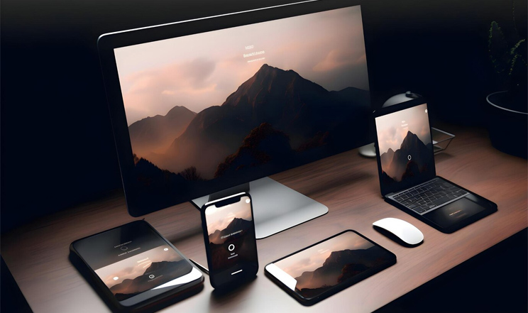
Are you fed up with websites that look good on your computer but a pain to use on your phone? Well, here's the fix you've been searching for responsive web designs. With responsive web designs, your website will look fantastic on everything, be it a computer or a tiny phone screen. Forget about the hassle of zooming in and scrolling endlessly; get ready for a smooth and easy browsing experience.
In this blog post, we're going to dive into the main features of responsive web designs and show you how to make a website that looks amazing on any device.


Importance of Responsive Web Design
- Enhanced User Experience Across Devices: Responsive web design guarantees that your website looks great, whether you're using a desktop or a mobile phone. This user-friendly approach makes navigation smoother, allowing visitors to easily find the information they seek.
- Improved Search Engine Optimization (SEO): Responsive web design contributes to better SEO by facilitating search engines in crawling and indexing your site effectively. This improved interaction with search engines can elevate your website's visibility and ranking in search engine results pages.
- Cost-Effectiveness and Time-Efficiency: Responsive web design proves to be more cost-effective and time-efficient compared to the creation of separate websites for diverse devices. Building a single website that adapts to various screen sizes not only reduces development and maintenance costs but also streamlines the overall process.
- Increased Mobile Visitors: As more people use mobile devices, having a website that works well on phones and tablets is crucial. Responsive web designs ensures your site looks excellent on any device, potentially boosting the number of visitors from mobile devices.
- Enhanced Conversion Rates: Making your website responsive doesn't just look good, it can also lead to more successful outcomes. Responsive web design enhances the user experience, making it simpler for visitors to find the information they're after. This improvement can contribute to better conversion rates on your website.
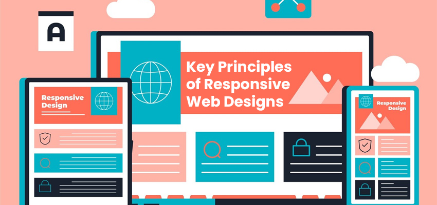
Key Principles of Responsive Web Design
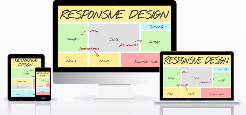
Creating Flexible Layouts with Fluid Grid Systems
Utilizing a fluid grid system allows for the creation of layouts that can seamlessly adjust to various screen sizes. This approach ensures that your website maintains its visual appeal on a range of devices, spanning from desktops to mobile phones.Adapting Images for Varied Screen Sizes
Images are dynamically scaled to fit different screen dimensions, ensuring they consistently look impressive across a spectrum of devices, be they desktops or mobile phones.Tailoring styling with Media Queries
To fine-tune the appearance of specific devices, CSS media queries come into play. By employing these queries, distinct styles are applied based on the device, guaranteeing that your website maintains its aesthetic appeal across the board, from desktops to mobile phones.Some Best Practices for Implementing Responsive Web Design
- Giving Priority to Mobile Users' Needs Because mobile devices have smaller screens, it's crucial to focus on what's most important for mobile users. This helps improve their experience and makes it easier for them to find the information they're looking for. For instance, you can start by designing your website with a mobile-first approach, where you create the design for mobile devices first and then adapt it for larger screens.
- Thorough Testing Across Different Devices To ensure your website looks good and works well on all devices, it's essential to test it on various devices and screen sizes. This testing helps you spot any issues and make the necessary changes to enhance the user experience. Tools like BrowserStack or Sauce Labs can be handy for testing your website on different devices and browsers.
- Constant Monitoring and Optimization for Peak Performance Responsive web design needs continuous attention to make sure your website works its best on every device. This involves tasks like optimizing images, making pages load faster, and overall, enhancing the user experience. Tools such as Google PageSpeed Insights or GTmetrix can be used to analyze your website's performance and find areas where improvements can be made.
How Responsive Web Design Affects SEO
- Enhanced User Experience: Responsive web designs guarantee consistent and optimal user experience across diverse devices, positively influencing user satisfaction.
- Decreased Bounce Rates: A responsive website offers a smooth transition between different devices, lowering the chances of visitors leaving due to a subpar mobile experience.
- Mobile-Friendly Ranking Criterion: Search engines, like Google, consider mobile-friendliness when determining rankings. Responsive design contributes favorably to this ranking aspect.
- Unified URL Structure: Responsive websites typically use a single URL for both desktop and mobile versions, simplifying the site's organization and aiding search engines in efficiently indexing content.
- Quicker Page Load Times: Responsive designs often incorporate optimized images and CSS, leading to faster page load times. This speed improvement is another factor considered by search engines for ranking.
- Reduced Maintenance Effort: Managing a single responsive site proves more efficient than handling separate desktop and mobile versions. This reduces the chances of errors and ensures consistent updates to the content.
- Increased Likelihood of Backlinks: A cohesive, responsive design raises the chances of users sharing and linking to your content, positively impacting your website's backlink profile—an essential component of SEO.
Conclusion
Adopting responsive web design is not just a passing trend; it emerges as a crucial strategy for businesses aiming to offer a seamless and enjoyable user experience across devices. Integrating responsive design principles enables websites to seamlessly adapt to the ever-evolving digital landscape, ensuring a broader outreach and sustained competitiveness in our increasingly mobile-centric world. Embracing responsive web design becomes more vital than ever, and partnering with the best web designing company in Noida can help you strategically future-proof your online presence. Also, choosing the right SEO services in Noida ensures that your website not only meets current standards but also enhances the user experience and increases conversion rates.